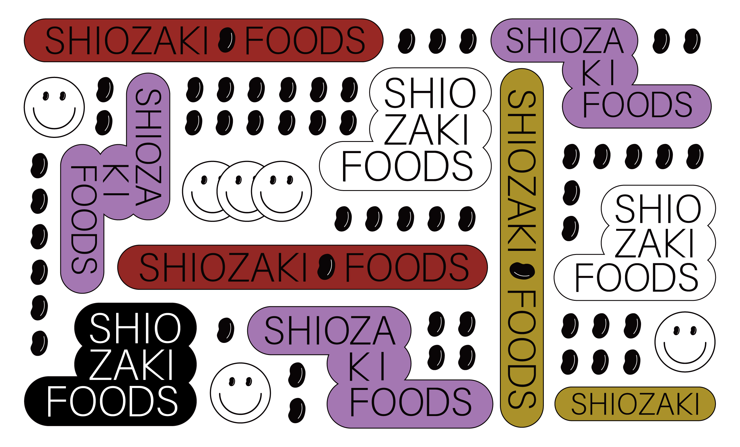
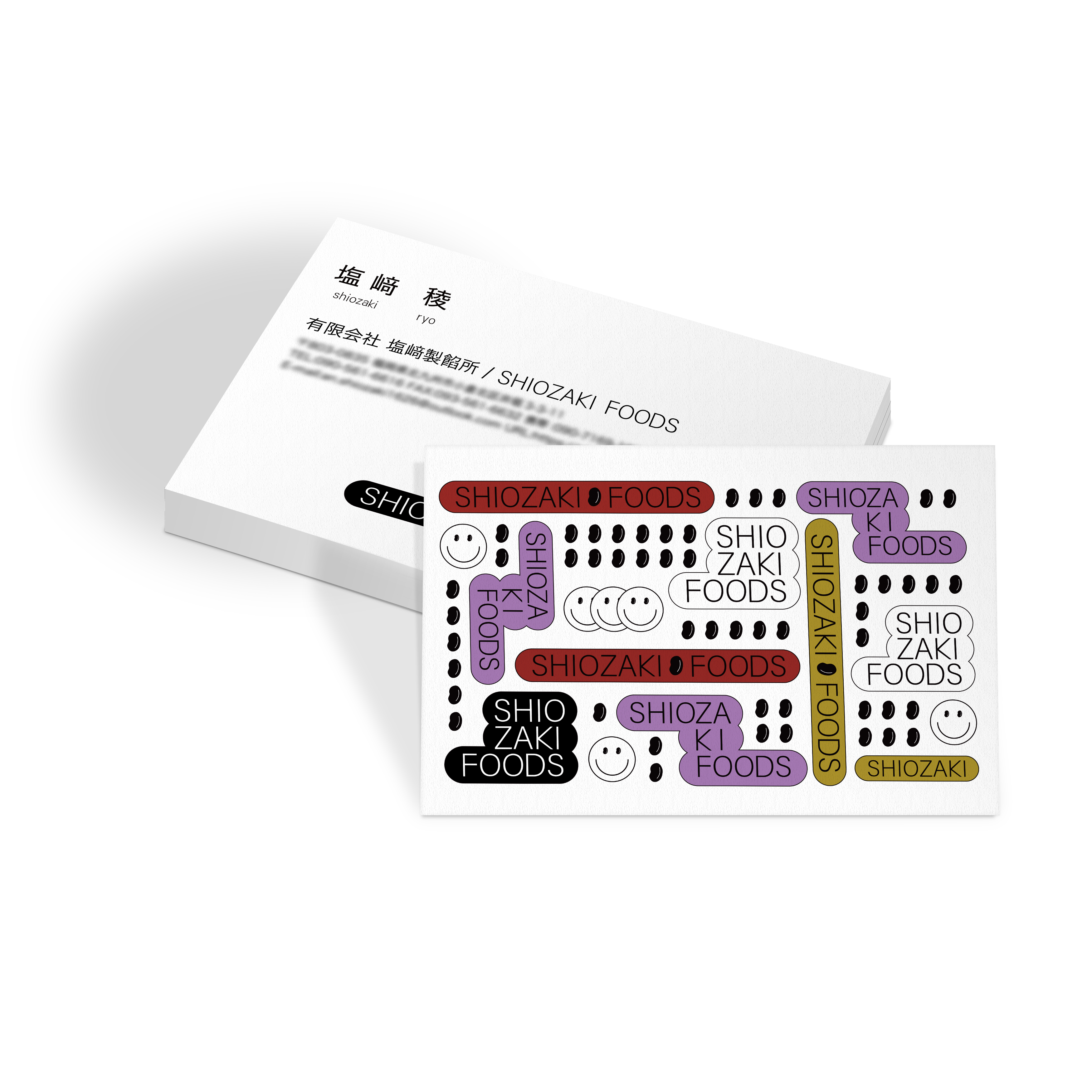
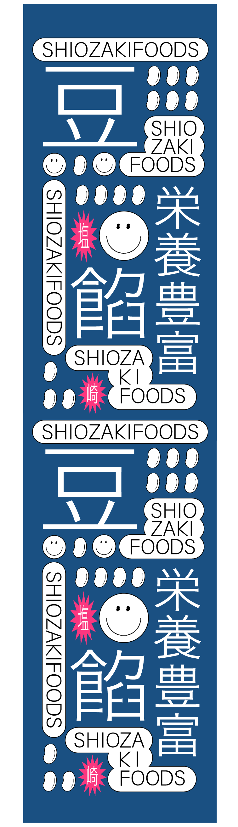
I designed a business card for a long-established bean paste manufacturing company, Shiozaki foods. We wanted to convey the goodness of Japanese sweets to young people, so I created a catchy design.
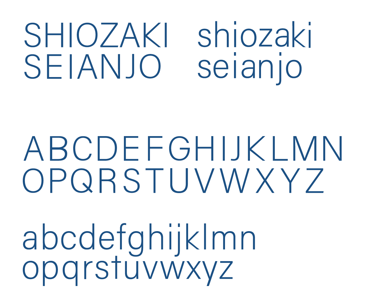
The font used for the business card was designed to be simpler and less wasteful, with an image of cleanliness when handling food.
老舗製餡所・有限会社塩﨑製餡所の名刺を作成。 若年層にも和菓子の良さを伝えたいという思いから、キャッチーなデザインに。
名刺に使用したフォントは、食品を取り扱う清潔感をイメージし、よりシンプルで無駄のない文字を作成。